
thanks Paul Bronks
Part 3: What in the PHAC is going on?
R. McCarter
thanks John
In the previous article I looked at the strange variability in the Public Health Agency of Canada’s (PHAC) records of adverse events (AE) caused by the mRNA vaccines and I questioned why PHAC did not alert us to the three rapid increases in adverse events that occurred over these weeks. In this article I will examine how PHAC has recorded and calculated the numbers of serious adverse events and went along with the story that the shots are the ‘safest vaccines ever’.
Using the total number of serious events that occurred over 68 weekly reports and the total number of mRNA vaccinations given over the same period, PHAC has calculated that there are 1.2 serious adverse events per 10,000 shots. With 9,878 serious reports resulting from almost 86 million shots the numbers agree with an average of 1.15 AE per 10,000 shots. This PHAC estimate is somewhere between the estimates given by other countries from a low of 0.3 AE per 10,000 shots in the Philippines and 3.1 AE per 10,000 in New Zealand.
Sounds at first that the estimate is reasonable, but the 1.15 hardly describes a nice bell curve of estimates for each of the weekly reports. The following graph shows calculations of serious AE per 10,000 shots for each of 66 reports over a 540 day period.
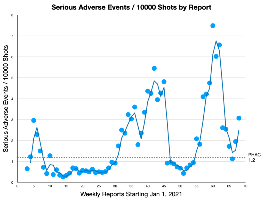
As in the last article which described changes in total adverse events, the data shows three peaks with distinctive rises, falls and plateaus. If the PHAC value accurately describes the rate of serious events, one would expect the weekly averages to distribute closely above and below the red dashed line, the PHAC estimate of 1.2.
There is obviously something strange at work. Weeks 11 to 27 average a low 0.49 serious AE per 10,000, weeks 32 to 45 average a higher 3.5 serious AE per 10,000, then for weeks 46 to 54 a drop below the reported average to 0.79 events and back up again to a high average of 5.52 serious AE per 10,000 for weeks 57 to 62. Not the simple average of 1.2 that we were supposed to believe.
As the first vaccine was rolled out there was a rapid 4.6 times increase from 0.65 to 3.0 AE per 10,000. Then, after that long low plateau, there was a 11 times increase in serious adverse events over a 15 week period from 0.5 to as high as 5.5 AE per 10,000. Months later, starting at 0.43 AE per 10,000 there was a 17 fold increase in severe vaccine injuries, rising to 7.5 AE per 10,000 in just 9 weeks. These increases occurred with each new bout of vaccinations and they should have been not just safety signals but danger signals. These were danger signals that PHAC either missed or ignored.
As in the previous article, the falls and plateaus are difficult to understand without the suspicion that PHAC was actively suppressing the numbers of adverse events. Oddly, PHAC also chose to progressively average serious adverse events, totalling all serious events in the previous weeks and dividing by the total shots over those same weeks. This was a great way to obscure short term changes in their data.
The following graph compares weekly averaging to cumulative averaging for the serious events:

The same data was used for both the blue graph and the green graph. The blue plots and trend line are based on weekly averages, calculating with each week’s serious events divided by that week’s total shots. This blue graph shows weekly rises and falls in the data.
The green plots show cumulative averages, as calculated by PHAC, totalling the serious events of previous weeks and dividing by the increasing numbers of shots over those earlier weeks. Any variations in the week to week data are diminished by the weighting of the previous values. After several weeks, any new report, no matter how divergent, can only shift the average slightly.
It appears that PHAC had something to hide.
There is another ratio that with good bookkeeping should be relatively consistent over the vaccination schedule and that is the ratio of serious adverse events to the total number of adverse events. The figure given by PHAC is 1.2 serious events per 10,000 out of a total 5.7 AE per 10,000 which means that 19% of all adverse events are serious. That ‘heretic’ Steve Hirsch has given a different value, 500 serious events out of 1100 or a serious-to-total ratio of 45%, over twice as high as the PHAC estimate.
The following graph shows the percent of adverse events that are serious for each of the weekly reports:
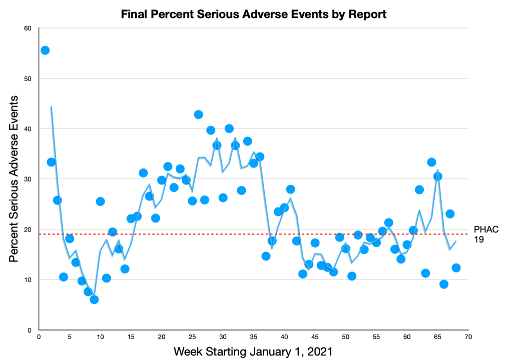
For the first 9 reports, the ratios dropped rapidly to a low of 6% serious events out of all adverse events recorded. The ratios then quickly rebounded to over 20% serious events. Between weeks 15 and 36 the ratios became somewhat stable averaging 31% serious events. Then, starting on week 37, there was a large correction. For the next few months between weeks 43 and 61 the ratios stabilized again at a new average of 15% serious events.
So which is it? 31% of adverse events are serious or 15% of adverse events are serious? PHAC ignores this discrepancy and uses the one size fits all – that 19% of all adverse events are serious.
But it becomes more complicated. In the PHAC archived data there are these boxes:

These sections give the number of new adverse events since the last report and break them down into both non-serious and serious. On their website, clicking on the ”i” in the upper right hand corner lets you know that these results are provisional and will be updated as new data comes in from the nether provinces.
This data can be used to determine the initial ratios of serious events to all initial adverse events for each of the weekly records. Here is the graph of those ratios expressed as percents:
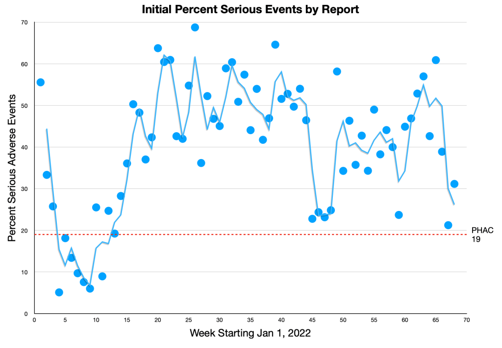
There is still that early drop from 56% serious events down to an implausible 6% in the first 9 weeks but then between weeks 15 to 44, the serious events are relatively consistent at an average of 50.7%. This is followed by that sudden drop, then another somewhat stable period from weeks 49 to 66 with an average of 43.4% severe adverse events. Overall, from week 12 to week 66 the average number of severe events is 45%.
This is eerily the same as Steve Hirsch’s estimate of 45% severe adverse events.
So how did the original data get transmuted into the final data from which PHAC calculated that one fifth or 19% of all adverse events were serious?
After the initial posting of the weekly report, data continued to trickle in. These delays apparently were caused by jurisdictions investigating and reviewing each adverse event before submitting the information to PHAC. Eventually, each report was archived when the data was no longer being updated. It is possible to look at how the data changed over that time.

The above graph shows the addition of non-serious adverse events in green and the addition of serious events in blue. With one exception in report 4 there were no additions for the first 10 weeks of vaccinations. For the next 15 weeks, up to week 25, there were significant additions of non-serious reports and almost no additions of serious reports. After week 25 there were an increasing number of added reports reaching a maximum in week 42 with 2,265 non-serious additions and 418 extra serious events.
Although the serious events were 38% of all of the initial adverse events, they amounted to only 12.0% of the added-on events. Initially there were only 9,678 non-serious events which were then inflated by a factor of almost exactly 4 to 38,792 non-serious events. From an initial 5901 serious events the numbers grew by only 1.67 times to 9,878 events.
To stay in a 38% ratio, the number of non-serious events should have increased by 2.6 times but the huge increase of 29,114 non-serious events is 7.3 times the the increase of only 3,977 serious events. This might be explained by an earlier reporting of the more obvious serious events. With more of the serious reports in the initial data there would be a higher proportion of non-serious events to be reported later. However, the difference in ratios is huge and it is suspicious that the number of add-ons to the non-serious events is almost exactly 3 times (3.008) the initial number of non-serious events – almost like a quota.
What is more difficult to explain is why more additions are made later in the reports. For comparison, the data can be split into the first 34 reports and the last 34 reports. By far most additions were made in the last half, with 26,692 non-serious additions which represented 81.4% of all non-serious additions in just 50% of the reports. Similarly, 3,024 serious events were added in the last 34 reports, 76.0% of the total serious additions.
You might think this oddity can be explained by an increased number of vaccinations, however, in the last 34 reports there were actually fewer shots, only 39% of the total doled out since January 2021.
Even if the ratio of non-serious events in the added-on data was increased by a reporting bias, you might expect that the ratio of non-serious additions to serious additions would remain somewhat consistent from one report to the next. The following graph compares the ratio of non-serious added events to the ratio of serious added events:

If the added serious and non-serious events stay in the same ratios as the initial data the top of the blue bar will be on the red dashed line, a ratio of 1:1. For all but one of the first 10 reports there were no additional events and the ratio non-serious:serious ratio stays at 1:1.
For reports 4 and 11, there were, in ratio, more serious events added than non-serious and the blue bar falls below the red line. In reports 12 and 13, there are proportionally more non-serious events added compared to serious events and the blue bar is above the red line.
The ratios of added events in reports 14 through 68 are highly variable, commonly reaching twice as many to as high as 10 times as many non-serious events as would be expected. To me, these huge differences indicate either very unorganized and erratic data collection or the deliberate dumping of large numbers of non-serious events to skew the data to predetermined values.
Either way, it shows that the Public Health Agency of Canada’s estimates of the numbers of adverse events are a fiction, a fiction that I believe greatly underestimates the dangers of the vaccines. But if that is the case, why are they adding so many adverse events? After all, adding these events would increase the estimate of danger from the vaccines.
I suspect that it became evident within the first few weeks of vaccination there were alarming numbers of adverse events being reported and to control the message the numbers were actively suppressed to keep true to the ‘vaccine hesitancy’ and ‘safest vaccine ever’ deceptions. The suppression was very successful, too successful, with the numbers of adverse events in new reports being calculated at about 2.1 AE per 10,000 shots with only 0.5 serious AE per 10,000 shots.
These numbers were likely to become an embarrassment when several other countries were reporting anywhere from 8 to 30 times higher values. Many of the weekly reports had already been published and archived, so to rebalance the numbers, it appears additional adverse events were dumped into the later reports. I suspect that a decision was made to increase the number of adverse events by an extra three times to get a number more in keeping with other countries.
There was another problem. Where other countries were reporting that 6% to 10% of the adverse events were serious, the PHAC estimate of serious events was high, 38% of all events. The solution seems to have been to increase the number of adverse events by adding on a large additional 300% of non-serious events. Adding on almost all non-serious events would have been too obvious, although this seems to have been done from weeks 11 to 25. In later weeks more of the serious events were added, increasing the serious events by another 67%, only two thirds of the initial numbers.
This graph shows the progression of adverse events per 10,000 shots over the 68 weekly records of PHAC:

The smoothness of the graphs occurs because the numbers are progressive averages like the ones calculated by PHAC. Each point is a cumulative calculation of the weeks before, averages based on greater and greater numbers, averages with less and less variability as the weeks progress.
If the averages were descriptive of the averages reported by PHAC, the points should randomly fluctuate above and below the red dashed lines with the points getting closer to the red lines with each new report.
Instead each graph has a rapid initial rise, then a rapid fall, changing to a gradual decrease. This is followed by a long slow rise, eventually reaching the seemingly predestined average adverse events per 10,000 shots.
It is difficult to see how this graph would be produced by a vaccine with a constant or even gradually increasing danger. I think it is more likely that during the first 9 weeks it became apparent that the vaccines were much more dangerous than expected, over weeks 10 through 29 the numbers of adverse events were suppressed and in weeks 30 to 68 extra adverse events were added to bring the adverse events up to predetermined levels. The extra adverse events were weighted heavily towards the non-serious events lowering the ratio of serious events from 38% to 19% to make the vaccines look more benign.
Now it seems evident why PHAC did not alert us to the rapidly increasing numbers of non-serious and serious events that occurred with the first, second and third shots. They were just fiddling the numbers and knew that interpreting their flawed data was meaningless. They fiddled while Canadians continued to take these dangerous shots and continued to be injured, disabled and killed.
PHAC: Looks like they were just making the whole thing up.
Something stinks at the Public Health Agency of Canada.
