
Part 2: How to Hide Numbers in Plain Sight
R. McCarter c/ John Mills
In the first part of this series I questioned the estimates of adverse events from the mRNA vaccines. Reports on vaccine injuries for several countries had calculated anywhere between 2.9 an 56.5 adverse events per 10,000 shots and the estimates of serious adverse events had varied from 0.3 to 3.1 serious events per 10,000 shots. Even with such large differences in estimates, Steve Kirsch is an outlier; he has estimated that the true numbers are 20 to 200 times greater, 1100 AE/10,000 shots and 500 serious AE/10,000 shots.
In this article, I will look at the Public Health Agency of Canada’s (PHAC) data to see how they have been able to estimate, and accurately report to two significant digits, 5.7 adverse events per 10,000 shots and 1.2 serious adverse events per 10,000 shots.
PHAC has an archive of vaccine safety reports going back to January 1, 2021. With a few skipped weeks, each weekly record looks like this:
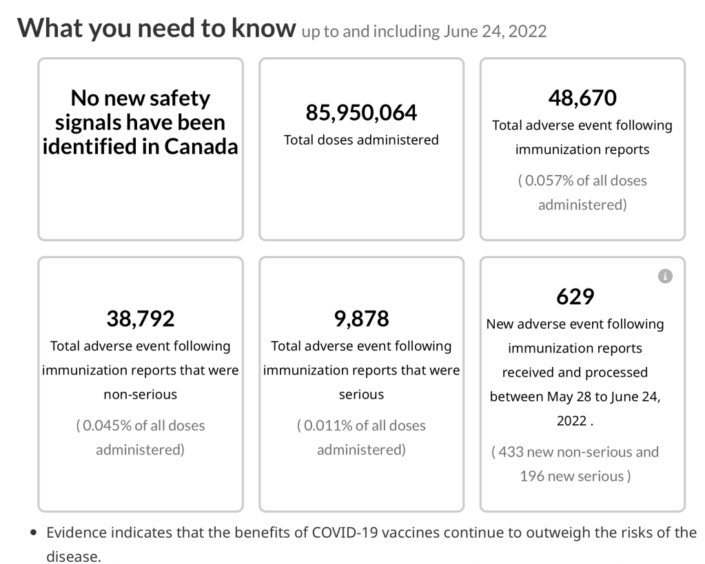
First block: Safety signals. The main reason to collect this data is to look for problems, increases in the rates of adverse events that could be dangerous.
Second block: The total number of vaccinations. By June 24, 2022, almost 86 million shots, or 2.3 jabs per Canadian.
Third: The total number of adverse events reported. There were 48,670 adverse events, 0.057% of the doses.
Fourth: Non-serious events, 38,792 or 0.045% of all shots.
Fifth: Serious events, 9,878 or 0.011% of all shots.
Sixth: New adverse events logged since the last report and a breakdown into the latest serious and non-serious events.
In the last of the archived files dated June 24, 2022, PHAC reports 85,950,064 doses given with a total of 48,670 adverse events and 9878 serious adverse events. This calculates as 5.66 adverse events per 10,000 shots compared to the reported 5.7 per 10,000, and there are 1.15 serious adverse events per 10,000 shots compared to the reported 1.1 per 10,000. Nothing to see here, the numbers closely agree.
But averages like these are only useful if they actually describe the set of numbers you are dealing with. If we believe that one number, 5.7, accurately describes the number of adverse events per 10,000 doses, then throughout the 67 data periods, we should see data points that fluctuate randomly around this value.
The following graph plots the total number of adverse events per 10,000 shots observed each week from January 1, 2021 until June, 2022. The red dashed line indicates the average calculated by PHAC.

Most of the points are calculated with large numbers, 64 of 66 points with over 200 adverse events, and of these 60 with over 300 AE, and 43 over 500 AE. Such large numbers should therefore give good estimates of the average for each data point. If the calculated 5.7 adverse events per 10,000 is truly representative of the data one would expect the data points to lie randomly above and below the average with most points clustering close to the dashed red line.
They don’t.
The large numbers of adverse events reduce random scatter making patterns obvious. A moving average, the blue line, shows distinctive non-random patterns of rises, falls and plateaus. In the first 6 weeks of the vaccination schedule the number of adverse events quickly rose to a high 17 AE/10,000 shots then fell over the next 7 weeks to 2.1 AE/10,000. For the following 16 weeks the number of adverse events plateaued, averaging 1.88 AE/10,000 shots and varying only slightly from 1.11 to 2.45 AE/10,000. This plateau would seem to give the best estimate of an average in the entire 67 reports but then things changed.
In week 29 the adverse events began to rise, increasing steadily over 12 weeks with a large jump over 3 weeks to as high as 35.5 AE per 10,000 shots. Then as if a switch was flipped the adverse events quickly dropped over the next 2 weeks to 7.2 AE/10,000, then a slight drop to a plateau for 6 weeks averaging 4.4 AE/10,000.
Starting in week 55, there was another uniform rapid rise, peaking after 6 weeks at an astounding 44.3 AE/10,000. There was then a sudden drop over 4 weeks, bottoming in week 65 at 5.6 AE/10,000.
Despite this highly variable data, PHAC did not calculate weekly averages. Instead they based their one average on total accumulated adverse events over 67 reports divided by the total accumulated number of shots delivered over 67 reports. This meant that their average was always biased by that strange long spell of very low numbers of adverse events between weeks 13 and 29. This odd averaging obscured any weekly changes in the vaccine injuries.
This would be the way to calculate if you purposefully didn’t want to find a danger signal.
If only the last 33 reports are used to calculate an average, the adverse events per 10,000 shots rises significantly from the reported 5.7 AE/10,000 doses to 16.4 AE/10,000 doses, almost a 3 times increase. It is sobering to think that 16.4 AE/10,000 shots, raises the risk of a person with 4 shots to 66 AE per10,000 doubly boosted people.
Report after report, 67 in all, PHAC has ballyhooed:
“No new safety signals have been identified in Canada”.
This is actually true, but It doesn’t mean that there were no safety (aka danger) signals. If you use methods that obfuscate and hide changes in your data you aren’t going to identify any problems.
There is a possibility that the patterns in adverse events result from changes in vaccination rates, that the number of adverse events does not reflect the present rate of vaccination but does indicate the vaccination rate one or two weeks earlier. The following graph compares the adverse events to the vaccination rate of the reported week (blue), then lags the data by one week (green), comparing the adverse events to the vaccination rate a week earlier. The adverse events are then lagged by two weeks (orange). A moving average is used to draw trend lines.

Even with one and two week lags in the vaccination rates, the same strange rise-fall-plateau patterns emerge.
Did anyone at our very educated very expensive Public Health Agency of Canada notice the constantly increasing slope of adverse events starting in week 29 (July 23, 2021)? At this time, when the second shot was in full swing, there was an 18 fold increase in adverse events from less than 2 AE/10,000 to over 35 AE/10,000 in a 15 week period?
Why did those same highly paid professionals not notice the jump, starting week 55, when there was a 9 times increase from 5 AE/10,000 to over 44 AE/10,000 in a six week period?
Even with my limited expertise, I would have thought these were safety signals.
Why would the high powered statisticians of PHAC use one simple average to describe such dynamic changes in vaccine safety? Why would they calculate that simple average over long and cumulative intervals that would obscure the week by week changes?
Are the professionals at PHAC incompetent or, even worse, are they actively trying to hide the changes?
Beforehand, one might have hypothesized a constant rate of adverse events but that makes the above pattern of rise-fall-plateau, rise-fall-plateau, not easy to explain. The rises could be caused by an increasing aggressive immune response to the mRNA and spike proteins with each new booster rollout. With the first shot, the first peak rises over a few weeks to 17 AE/10,000, with the second shot, the second peak gets as high as 35 AE/10,000 and a booster pushes the third peak to a huge 44 AE/10,000.
Any competent health official should have been fully aware of the possibility of synergistic effects of this series of vaccines but they all seem to have missed the significance of the increases in adverse events.
The falls and plateaus are more difficult to understand. The adverse events are calculated per 10,000 shots and therefore are corrected for changes in the rate of vaccine delivery. Unable to think of any natural causes, the most likely explanation seems to be that the short-sighted and foolish attempt to lessen ‘vaccine hesitancy’ led to an active suppression of the numbers of adverse events.
I suspect that within the first 6 weeks of use, the danger of these vaccines became alarming with adverse events exceeding 17 AE/10,000 doses. An urgent message appears to have gone out and the number of adverse events began to drop in the week of February 26, 2021. Within a month, the reported adverse events were now down below 2.5 AE/10,000 and remained suppressed for the next 17 weeks. During that time, PHAC appears to have discouraged and censured several doctors and their troubling observations, including the inconvenient Dr. Hoffe and his his April 5 letter reporting adverse events among his patients. With their ends justifying the means, PHAC appears to have trampled over ethical physicians, forced their data under control with numbers down below 2 AE/10,000 shots, and continued to roll out the ‘safest and most effective’ vaccine ever.
What could this mean for someone who received three shots? Could the risk of the first shot be as high as 17 AE/10,000 shots, could the second shot add another 35 AE/10,000 and the booster add another whopping 44 AE/10,000. This would be a total risk of 96 adverse events per 10,000 boosted people and this does not take into account that adverse events are historically undercounted by 10 to 100 times.
We are edging ever closer to Steve Kirsch’s estimate of 1100 AE/10,000 shots.
Is there actual evidence that the number of vaccine adverse events was being suppressed? In the following graph I plot the number of adverse events per report against the number of shots given per day during that reporting period:
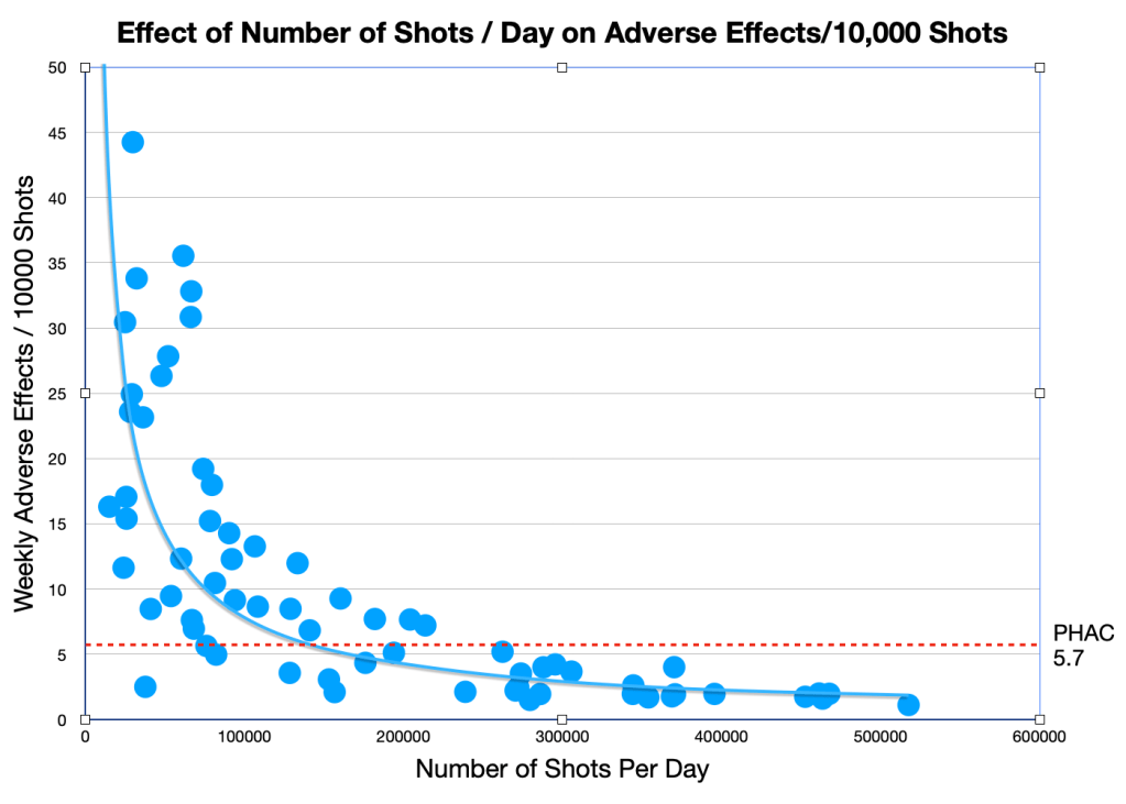
Before setting up the graph I presumed that the number of shots per day would have little effect on the average number of adverse events per 10,000 shots, after all there are huge numbers of daily shots and there are large numbers of adverse events. Large numbers should reduce random variability and I expected that most of the data points would cluster closely around the average AE/10,000 given by PHAC, the red dashed line in the graph.
However, the graph shows that the greater the number of shots per day, the lower the number of adverse events per 10,000 shots. Judging by the graph, if we had only reached 600,000 shots per day we would have had almost no adverse events at all.
The hyperbolic shape of the graph is similar to what you would expect if a constant numerator is being divided by an increasingly larger denominator. The shape of this graph can be explained if the number of adverse events is being capped (near constant numerator) even though the number of daily shots increases (increasing denominator).
The above evidence certainly looks like PHAC is actively suppressing the increasing numbers of adverse events and this raises some interesting questions about whether they are slavishly allowing ‘vaccine hesitancy’ to justify lying to the Canadian public. Even worse than lying, are these policies severely undermining the trust Canadians have had in their health ministries? Worst of all, are the political loyalties of PHAC rationalizing policies that endanger the health and lives of Canadians?
Even with this superficial look at the numbers there is reason to think that something stinks at the Public Health Agency of Canada.
But there’s more! If the numbers are being fudged, there are often residual traces left in the data. The next part in this series looks at problems with PHACs calculations of serious adverse events.

Leave a comment