
The new Covid Donuts are out for the four weeks ending May 7, 2022!

Compared to last week there are still 51% boosted, 32% double vaxxed and 14% unvaxxed. The only observable donut change is that the single vaxxed are down a tenth of a percent from 3.5% to 3.4%. Compared to three weeks ago there has been a 0.4% change in single vaxxed from 3.8% down to 3.4% and a change in boosted from 50% to 51% (rounded). The recalcitrant unvaxxed are holding firm and with the reluctance of others to get that third shot, it appears that the message is getting out.
Despite 83% fully vaxxed, this week the number of deaths has jumped ahead to 255 souls. Just three weeks ago, over the four weeks from March 20 to April 16 there were 94 deaths. I can just imagine that the health cartel is itching to demand even more vaxxes, masks, mandates and lockdowns. Nope, it’s not the unvaxxed that have caused this surge, fully 90% of the deaths were fully vaxxed and of those 70% of the deaths were in the boosted. On a cheery note, this is down from 91% of the deaths among the fully vaxxed from the week before.
With a quick appraisal of the donuts it would appear that the unvaxxed are underrepresented in deaths, only 9% deaths with 14% unvaxxed, and the boosted are overrepresented with 75% of the deaths with only 51% boosted. But stats are more complicated than that. Take a look at this breakdown of Vaxx Status by age group:

It is obvious that the boosted have a much higher proportion of the elderly and the unvaxxed have many more young children, and as we know, very few children die of Covid. This difference will bias the boosted towards a higher death rate, we are comparing apples with oranges. Fortunately there is enough information given by the BCCDC to correct for age differences.
The BCCDC data is enumerated by age group and we know the numbers of unvaxxed and vaxxed for each age group. In the following graphs I use only the data for ages greater than 60 and compare vaccine status with the percentage of cases, hospitalization, critical care and death.
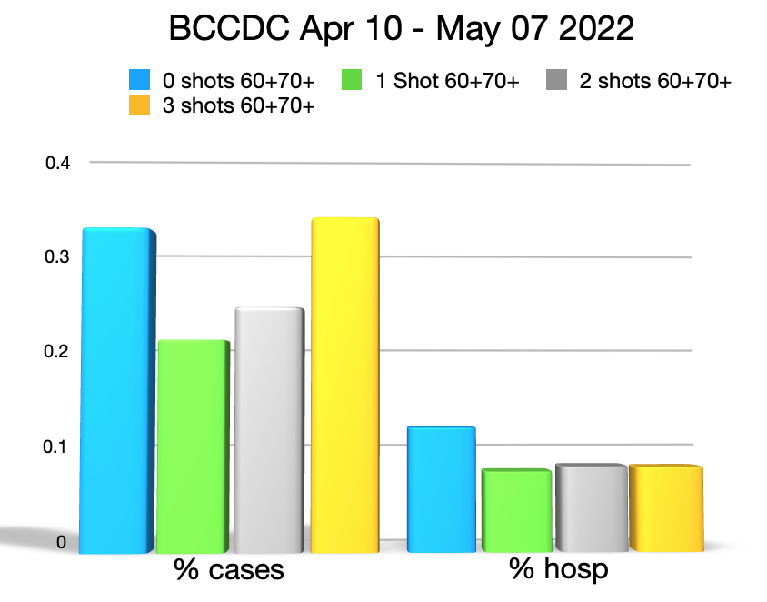
In the above graph, the blue bar to the left represents the percentage of unvaxxed 60+ year olds who are counted as a Covid case, the blue bar to the right is the percentage of 60+ unvaxxed that are hospitalized. Green represents the singly vaxxed, grey the doubly vaxxed and yellow the boosted. From the graph you can see that the boosted have slightly more cases than the unvaxxed, Oddly, the singly vaxxed have fewer cases than unvaxxed, doubly vaxxed or boosted. The unvaxxed appear to have a slightly higher chance to be hospitalized, and again the singly vaxxed have a slightly lower chance than any other group.

Things become stranger when we look at critical care and deaths for the over 60s. The unvaxxed are just about tied with the boosted for critical care, and again it is the singly vaxxed who are least effected, why are the doubly vaxxed over represented in critical care? Looking at deaths, the percentages of over 60s is about the same despite vaxx status.
Not sure what to make of this but I have read that the singly vaxxed are often discounted as being unvaxxed. I decided to graph the data as undervaxxed, lumping together unvaxxed and singly vaxxed, and compare these to doubly vaxxed and boosted.

Now the blue bar is the undervaxxed the green bar the doubly vaxxed and the grey bar is the boosted. The cases in the undervaxxed appear to be an average of doubly vaxxed and boosted. There are slightly more undervaxxed hospitalized than either doubly vaxxed or boosted. Could this be an artifact of testing? In some districts, the undervaxxed are tested when they enter a hospital while the fully vaccinated are given a pass. I’m not sure what the policy is in BC hospitals.

The percentage of undervaxxed 60+ year olds entering critical care is the same as the boosted and yet significantly less than the double vaxxed. Death rates are about the same for undervaxxed, double vaxxed and boosted.
There is another way of looking at the numbers. With each passing week, the double vaccinated are turning into the boosted and it takes some time for critical care rates and death rates to mature, it may make sense to combine double vaxxed with boosted, call them the fully vaccinated and compare them to the undervaxxed.
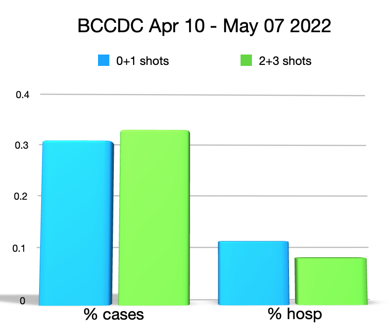
The blue bars are the undervaxxed and the green bars are the fully vaxxed. With small differences, the percentage of cases and number of hospitalizations are about the same for both vaxx statuses. There is perhaps a testing bias increasing the undervaxxed hospitalizations compared to the fully vaxxed.
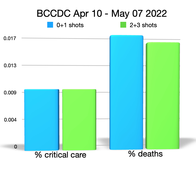
There is no difference in percentage of critical care for the undervaxxed compared to the fully vaxxed and only a slight increase in deaths for the undervaxxed (0.017%) compared to the fully vaxxed (0.016%). This small difference represents one extra death among the unvaxxed, statistically insignificant.
No matter how you crunch and combine these numbers it would look like there is little or no benefit from the mRNA vaccines for the 60+ age group, the people most affected by Covid. All of that blather about the undervaxxed being a drain on the health care system was just blather after all. Being undervaxxed, you seem to be in no greater danger of catching Covid, hospitalization, critical care or death. Being vaxxed, fortunately you are also in no greater danger of catching Covid, being hospitalized, having critical care or dying, of Covid. Unfortunately, each experimental shot you get does expose you to severe adverse reactions, including death, and it would appear that these numbers may be frighteningly large.
Even for those over 60, the Covid mRNA vaxxes appear to be of no benefit but have a lot of risk.

Leave a comment